identity
Brand identity naming and redesign

the issue
In just a few years, the Chèque déjeuner group has become an international group (existing in 17 countries), moving from a company issuing payment entitlements to a service group offering meaningful integrated solutions.
To succeed in accelerating its transformation, the Chèque Déjeuner group must respond to several issues: an accelerated international development, a densification and diversification of its offer as well as growing dematerialization of entitlement payments.
For its 50th anniversary, the Chèque Déjeuner group wanted to reorganize the company to support this transition.
- So, how do you give a new dimension to the corporate-brand to meet the group’s concerns, both in France and abroad?
- How do you organize, structure and standardise all the group’s brand products and the offers in each country?
- How do you emphasise more effectively that the product brands belong to the company brand?

bearideas' solution
a unique brand, a unique name
With an aim of internationalising and demonstrating the offer’s wealth and diversity, what if Chèque Déjeuner changed its name?
A new name, a new signature:
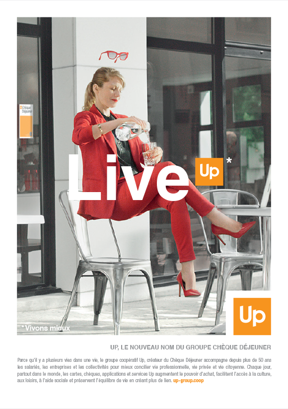
Up – Making every day better
The group chose to adopt a visual identity capable of signing its future and giving them a new breath of life, whilst accompanying them in their ambitions.
From now on, the group will be called Up, a synonym for action, movement and progression.
The name Up, meaning going higher, is universal, understandable and accessible to all.
The new logo capitalizes on the historic codes of its identity, by keeping its orange colour, its square shape, its font and is fully in line with the Group’s mobility and modern values.

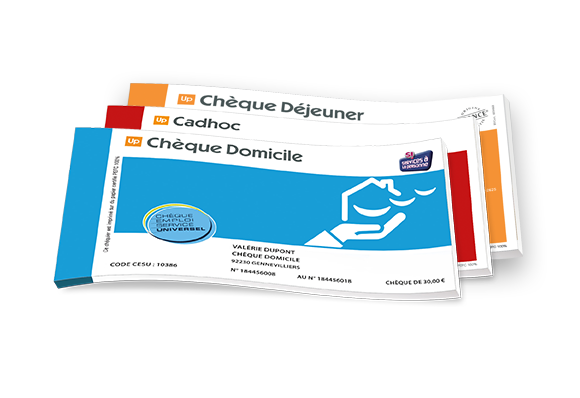
One name, several brands
The product brands offered by the Group are well known: chèque Cadhoc, Chèque Culture, Chèque Déjeuner…
The offer’s structure has been revamped. Each of the Group’s activities now link to the parent company, by having the Up logo on all its offers.

key results
Deployment in less than 6 months on 17 countries
and over one hundred brand products.
A reputation of more than 15 points has been reached
less than a year after its launch.